Coffee Banana

Tuesday, June 27, 2006

Writing within the Design Process

It is always the opinion of many that drawing is a critical skill a good graphic designer should master. Drawing is part of the design process where ideas begins to make sense and take form. It doesn't matter if you draw with a pencil on paper or a stylus in photoshop, the exploration of ideas by drawing is almost necessary.

Illustrators and Painters draw and sketch probably everyday not only to enclose themselves in a world of ideas and their work, but also to improve their skills. To them the art of drawing is of paramount importance. I doodle almost everyday, not to improve my drawing skill (though to improve the skill of drawing, requires that you draw often), but to explore varied ideas for the varied projects that I have planned for myself.

A sketch, a doodle, a completed painting - speaks a thousand words. Yet, designers seldom use words to explore ideas.

Words, often are clearer than messy doodles. To write, requires you to think and rethink. The exploration of ideas through writing, as what I am about to suggest is not to replace drawing, but to add clarity to the already mysterious design process. Writing demands the clarity of thinking, that sketching might not require. Writing is rigorous and meticulous. Drawing is organic and unconstrained. Both has its place in the design process.

The exploration of concepts and ideas through writing allows the designer to place serious consideration on its importance. While drawing, we may allow the focus on form to complicate or compete with the exploration of concept. With the absence of any visuals or pictures, the focus falls squarely on concept. It brings awareness to meanings of words and narratives. Writing gives concepts a voice, that a sketch or a doodle may not show.

When writing, especially when we want our clients to be involved in the process, it is vital that we be as clear as possible. Concept is king, yet its importance might be lost because of ambiguous writing. The concept of concept is already mysterious to the client, it does not need ambiguous writing to cloud its purpose. Let the words be yours and your client's guide.

The speed of writing may seem to affect the flow of the design process, especially when it seems that the benefit of speed and quantity of ideas may be advantageous to the conceptual development. However writing – I have said this too many times – requires that you think. Thinking deep before you commit anything to words will allow the discovery of many more varied solutions, that will ultimately contribute to the quality of your design.

Other than the conceptual development, other stages of the design process may also benefit from the use of writing. Your roughs and thumbnails sketches may reach another level of clarity if you tag it with a few words about the composition, discussion of fonts, choice of color, etc.

Designers may not need to be writers but designers must write. Writing makes designer critical thinkers and articulate ideas clearer, thus, making them better designers. We all say designers are communicators . Visual communication is not the only way of communication, the written words happens to be one of them and – sometimes we forget – most common.

Technorati Tags: , , ,

Further Reading:
Designers must Write
The Art of Thinking through Making
Writing for Design Professionals

Sunday, June 25, 2006

Impossible is Nothing is Impossible


Impossible is nothing. At first, I have to admit that phrase has almost no meaning to me. I am slow at 'getting it' and I thought that the Adidas tagline is just another tagline in this world of taglines. So one day, while jogging with a friend of mine, he asked me whether its possible for me to complete my 2.4km run in 7mins. Breathlessly I said, "That's impossible!" "Nothing is impossible my friend." he replied in an almost mocking manner. I continued with another reply, when I should just stop. "Yes. 2.4 in 7mins is impossible." "Well." he said in an authoritative tone. "Impossible is nothing then."

In that moment, I got it. I understood the magic and relevance of the Adidas tagline. And for some reason, since I got it after months of being exposed, the tagline and Adidas as a whole seems to me like a smarter company. No - I didn't rush down to the Adidas concept boutique to buy a whole load of shoes and sports jackets. But it did make me consider them.

Taglines are powerful words created as a basis of an advertising or a marketing campaign. Used correctly, taglines can be an indefinite everlasting soul to a company. It moves beyond being just an advertising tool, it becomes an integral part of the identity. Just do it. Three short words that have made Nike a prominent entity in the marketplace for what seems like an eternity. Other companies had tried, but not with similar success.

However the power of taglines are only as powerful as its audience's ability to understand it. First there are people like me. Slow at getting it. We are not dumb (some might argue), but we just don't get it easily. Ink Different (Canon failed tagline). What is that suppose to mean? I'm lovin' it. I'm loving what exactly? Don't even get me started about Uniquely Singapore. Taglines are summarized visions and missions statements and that it is summarized to a point of being generic. If the law is not a problem, even Microsoft could use the tagline Just Do It. Then there is the language barrier. Notice most of these taglines are in English. Most people in china can't understand a word of english. Heck, not all Singaporeans can understand English. What's is Just Do It in Malay? Buat Sahajalah? Doesn't sound too catchy.

Some companies use taglines as they would logos. They print them everywhere. Business cards. Packaging. Boxes. Taglines, once created just for promotional, has become a second logo. Often appearing beside or under a logo. A second logo that may have all the wit and smarts of a tagline, but it also has all its weaknesses. What is Impossible is Nothing in Malay?

Further Reading:
Tyranny of Taglines
Swoosh

Technorati Tags: , , , ,

Friday, June 23, 2006

Designing within Context

What makes a logo work? Is it good outstanding design? Or the success of the company that owns the logo? Is the success of a logo beyond the control of a designer? What does a designer do then?

Read Michael Bierut blog entry over at Design Observers
The lettering in the Chanel logo is neutral, blank, open-ended: what we see when we look at it is eight decades' worth of accumulated associations. In the world of identity design, very few designs mean anything when they're brand new. A good logo, according to Paul Rand, provides the "pleasure of recognition and the promise of meaning." The promise, of course, is only fulfilled over time. "It is only by association with a product, a service, a business, or a corporation that a logo takes on any real meaning," Rand wrote in 1991. "It derives its meaning and usefulness from the quality of that which it symbolizes."
Technorati Tags: , , ,

Wednesday, June 21, 2006

The Eyes of the Artist

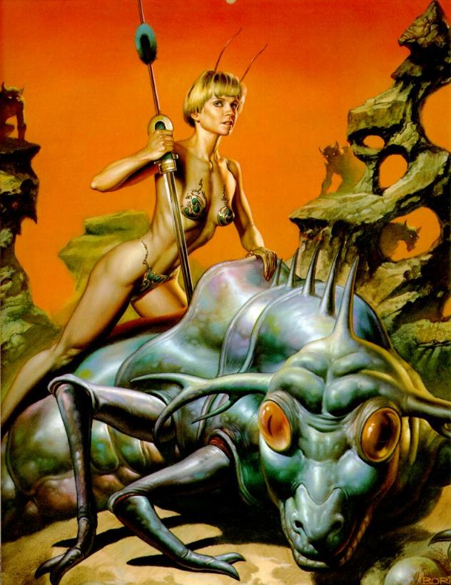
An article in June's Imagine FX features the much-esteemed artist couple Boris Vallejo and Jullie Bell. I was quite surprised to see Julie Bell, especially, working on such incredible traditional medium fantasy art, since I think I can vaguely remember she had a website of her own with some very good anime tutorials (ah, the days when I was all hardcore in anime art). She's now married to prodigy artist Boris and together, their creativity has synergized into something almost alive. They push eachother forward and bring new perspectives to eachother's view of life, which inevitably manifests in their art.

The fantasy genre, aptly described as "freedom", allows this creative energy full reign as their subjects depict strong men and women as partners (a reflection of their own marriage). Their clouds, textures, enviroments and creatures are truly the stuff of dreams, yet the photorealistic human figures are so real it's almost as if this vision of freedom were attainable. And they paint so well with traditional medium that it makes this digital artist want to bite her stylus in half and get married to box of oil paints.

When asked about where they get their ideas, Boris had this to say:

"That's a question people always ask," says Boris. It's also one that can't be answered: "To tell you the truth, we don't fee that we come up with ideas. The ideas come to us." You have to be a conduit: "The ideas are already there, we are vehicles for them."

Julie seems surprised that anyone could ever lack for ideas: "it's like every time you turn your head you see something. Out of hte blue you'll just look at a stain on the table and it'll look like something and you just go 'oh my god'." And off you go.


What I think can be learnt from this is that creativity is not something that comes from within, it's something that comes from without. To see the wonder in the world and let it work through you and your art. Maybe fantasy art isn't so much the representation of dreams or 'fantasy' as something unreal, but reality shown to us in all it's beauty. It may seem hard to see the wonder in things so mudane, but artist Jason Chan, a personal favourite of mine, show us that it's not in Imagine FX's May issue:

"In a way," says Jason Chan, "my art is a way for me to show people my mind and how my mind interprets the world." That interpretation is rich with something we all too easily overlook in our daily lives: "The feeling of otherworldliness and mystery."

"Fashion, people I know and life experience, I can draw influenced from
anything." Jason channels it through into that fantastic mental filter and out it comes: "If anything sparks my interest, you may see it in my painting." Art is the expression of a person's experience.

His piece Angel Flight was inspired from his observation of a fence on an overpass.

Therefore, it appears that to be 'creative', to be able to show everyone the world as you see it, you need to take see the mundane through your own mental filters, seeing the artistic wonder of the world around us. And to see the wonder of the world around us requires a certain something, and I think Terry Pratchett described what that something is very accurately in his description of the Discworld character Leonard of Quirm:

Any sensible ruler would have killed off Leonard, and Lord Vetinari was extremely sensible and often wondered why he had not done so. He'd decided it was because, imprisoned in the priceless, enquiring amber of Lenoard's massive mind, underneathe all that bright investigative genius was a kind of wilful innocence that might in lesser men be considered stupidity. It was the seat and soul of that force which, down the millenia, had caused mankind to stick it's fingers in the eletric socket of the Universe and play with the switch to see what happened - and then be very surprised when it did.

Tuesday, June 20, 2006

Form Vs Function (Again)

Orange stripes on a pale beige background. Purple serif fonts. Decorative floral borders. The choices of some designers astound me and not in a good way. And yet the guilty poster that was clumsily placed on the notice board with push pins functions. There was a visibly proper information hierarchy. Mostly legible. We all get it. It's just – ugly. It was the tragic tragedy of the century.

I have to admit, I am one of those poor sods who believes that everything is design. And I really mean – everything. (Except probably the creation of the natural world. I am a staunch believer of natural selection) From the design of the mouse to the design of the motherboard inside the Mac. To me design is the factor that mitigate all the inevitable daily hassles of the real world. Here I have to say that the design of the door handle is flawed. If you have to push the door, why is there a door handle? (Instinctively, you pull a handle not push) Of course this belief gives me the impression that capital D - Designers are Gods. And in these era of complexities and information overload, Designers are truly Gods.

I am also one of those poor sods who blindly believes that the practice of design requires that problems be solved. Ask any designer what they do, and they will mostly say that they are problem solvers. Designers indeed solves problems, just that sometimes we lose track of what problems we are suppose to solve.

The pursuit of functional goals within a design project is inevitable. The business card needs to contain the contact information. The logo needs to be able to be printed in both grayscale and full color. The inclusion of functional goals in our work is what makes us designers, and not fine artists.

However, when a project becomes mainly the pursuit of the form, designers tend to complicate things to make it appears more than just what it is. Ask a designer what they do, and probably none would say they make things pretty. And yet that is what a designer does.

Form follows function. Function over form. These are mantra that are chanted by designers all over. The focus on function perhaps makes our jobs appear smarter. More important. Makes it a professional practice. To place an importance on form, makes designers, stylist. People who makes things pretty.

Perhaps it is the difficulty of justifying choices that pertain to form. It is easier to explain the necessity of a uniformed look and feel in an identity than the look and feel of the identity itself. Explaining why you choose a certain font for the headline with a - "I don't know, I just like it," isn't exactly respectable.

But that's what we do. We use our gut feeling and instinct to make choices that would make the design of that poster work. We just know and can't explain why certain fonts are better in certain situations than other fonts. A legible design is not enough. It has to be beautiful. At least to our and the client's eyes.

Form is Function.
Let us make that our new mantra.

Technorati Tags: , , , , , , , , ,

Sunday, June 18, 2006

Manga's Bad, Mmmkay?

Walking into Kinokuniya is dangerous. The initial plan was to pick up Imagine FX June (a pretty good digital painting magazine by Future Publishing). Turns out, Imagine FX July is in. Pick up. Head to my favourite manga section to see if there are any interesting series out.

Oh no, there are.

The english translation of KamiKaze by Shiki Satoshi caught my eye. After ages of collecting the comic in chinese, I can finally understand the story, not just oogle the awesome pictures. The art of this manga is awesome. It's pretty gruesome, limbs flying everywhere sort of thing, yet it's all tastefully done. Being a Shounen manga, there are, of course, a fair number of panty shots, naked high school girls and explosions every which way. Still, the toning, line art, and character design is just delightful to behold. And what impresses me most is the dynamic presentation of the action in the panels and the way water is illustrated here. I used to go to this manga for water references. A good buy. I sigh and pick it up.

I look down. Yami No Matsuei. Oh my god! My favourite shoujo manga of all time! Muraki is such a sadistic sexy bitch, one of the best villians presented in a long time, not since Shisho of Rurouni Kenshin fame! The psyche of the characters are compellingly revealed, along with all their fears, vulnerabilities and anxieties. I hover over the book, wondering if I should buy it... The art isn't all that fantastic, typically Shoujo - thin uniform lines, tones used more for ambience and textures then shadows, pretty boys flying every which way. The characters though, are like old old friends. Oh what the hell, I'll be poor next week anyway. Pick it up.

Now I have to start collecting Vagabond again - a great rendition of Eiji Yoshikawa's Musashi, with spectacular art. I sometimes curse this throw-away mentality Japanese manga seems to have. I have a whole series of the Flame of Recca in chinese (ah, the days before Kinokuniya graced us with Tokyo Pop, Viz and et cetera) and I've no idea what to do with them. Japanese manga isn't particularly collectible, however compelling or well-drawn it may be. The speed at which manga is produced has proliferated the artform to the point where most of the books have no real value except to the most hard-core of Otaku.

Unlike American comics, where each page takes one to two days to produce, mangakas and their assorted minions produce four pages a day. That's insane. Of course it's a group effort, but you have to admire the guys for conceptualizing, designing, directing and drawing page after page at such speed - only to have their books thrown away or sold for second hand at dirt cheap prices.

Be that as it may, my manga purchases set me back almost forty dollars. Cursed import price jack ups. Manga's bad, mmmkay? But it's perfectly mmmkay to indulge in it once in a while.

Saturday, June 17, 2006

Looking for Style

It's not uncommon for me to draw things based on my favourite Fantasy Of The Hour. I remember way back when I was seventeen, drawing on the train as I endured the 2 hour trip to school. I really wonder how I had the courage to sit there and draw infront of all those people. My shading wasn't very good, composition sloppy and my art had more yaoi overtones than I'm willing to admit even to this day. And they were Anime. A bit too anime.

Don't get me wrong, I love anime. I watch it near everyday, I talk about it, sometimes even wish there were men in real life with nine-tailed mystical foxes sealed in their navels and blonde hair who could replicate themselves with ninjutsu techniques. I have seen some incredible Anime art, but the popularity of the genre has spawned a massive amount of pictures of generic, big-eyed figures posing randomly. In a genre with such a following of artists across the whole spectrum of skills, distinguishing yourself is incredibly difficult.

Just finding a way to establish your own style is hard enough. From what I've observed, style comes in the shape of the eyes, representation of the figure, amount of detail and method of coloring. You can tweak these in any which way, but there will still be someone who draws in a similar way. I have come a long way from those random little sketches in the train, but I'm still looking for a style of my own.

Developing your own style is difficult. It's like developing your personality, only on paper. In an excellent article by Jason Beam, style is described as an extension of oneself, a visual of how your brain works. (If that's the case, I think had way too many homo-erotic inclinations when I was seventeen.) Style is what makes your paintings memorable, something that is you.

I believe myself a very pedestrian kind of artist. I just plod along, picking up techniques I like from here and there, trying to integrate them into my art. Thus, my style keeps changing, sometimes according to my mood, or a piece of art that inspires me, the medium that I use... I seek my own style, yet I never settle on any single style I end up developing. Looking back at my old gallery on Deviantart is kind of like going on a journey. I can see my style changing.

I really think it was dissatisfaction that spurred me on to keep changing my art. Dissatisfaction at the way my art looked compared to others and the subsequent influx of humility has forced me to keep changing, keep trying. Sometimes I really wonder when on earth I'll settle on a style that I'm satisfied with, but then I realize that that would mean the death of my art.

Style by Jason Beam

The Allure of Digital


Last Christmas, I gave Kristen a print-out of a digital painting I did as a Christmas present. I was not being cheap (though designers are usually misers). I even framed the print-out and it looks pretty good. I must say I was pretty proud with the painting.

However, during the gift exchange part of the dinner, where we publicly rip apart wrappings and show our sincere (sometimes not too sincere) thanks towards the giver of our gifts, I discovered that I am not too proud of Tempest – the title of the digital painting that I gave Kristen. It was not the work itself, but the medium of the piece. It was entirely digital. No sketches. No messy oil paint or runny watercolours. It was conceived entirely in Photoshop and Painter.

Friends around the table generally respond kindly and favourably towards the print-out, but most asked me how I did the painting. “Was it done in Oil?” “How did you do this?” “This is amazing.” I could not bring myself to say that it was done in Painter, the computer software than simulates the natural medium. I could not bring myself to say that it was colour corrected in Photoshop, and that it was printed with a high DPI so it looks good and real.

If the situation was in a digital illustration forum or Deviantart even, I would be quite please with myself, proud even. However this was real life. And to me, the general consensus with digital artwork in real life is, it’s easy to do.

Even though I consider myself a graphic designer first, illustrating and drawing has always been something I do to express myself creatively and emotively. It is a hobby - a hobby that brings pleasure. When I first started drawing, I was an overgrown teen in a train, sitting beside the ever talented Kristen. I started with the pencil and like many overgrown teenager, I was amazed with Japanese Anime, and wanted to draw impossibly sharp featured boys with ridiculously huge eye balls. As this went on, and my drawing skills improved – or at least I manage to convince myself that I had improved – I was eager to add colour to my drawings. Naturally I turned to the computer. Ever since, my artworks are exclusively digital.

Digital artworks are not easy to do, but probably they are not the hardest. They are not as messy as oil and watercolour. There are multiple levels of undo. Magical layers to help you. And most importantly, art software is widely available to everyone. And perhaps because of this, the allure and exclusivity of the craft is lost, hence regarded as not true art. Something that is easy to do.

Though we have to admit that to create art digitally is less tedious than say, using chalk and oil, is digital art less art than real oil and chalk art. To answer this, we have to ask ourselves, how do we judge art? Do we judge a piece of artwork purely on its execution? Or do we judge just the concept and imagination?

Digital painting may never have the romance of oil painting. The combination of the mess, smell, texture and the ability to touch oil painting makes it undeniably real. But do not discount digital painting just because it’s binary. It requires just as much imagination and creativity (perhaps even more) as any oil painting, and maybe even just as real.

Friday, June 16, 2006

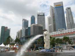
Design of Singapore


It was probably the watching of Project Runway 1 & 2 reruns. Or it was a deep down desire to be a contestant in that show (even though I am hardly a Fashion Designer - garment construction, what's that?). Whatever it was, I had a disturbing dream. I dreamt I was contestant in Project Runway International, where designers across the globe compete for the title of Best Fashion Designer. In that particular dream, the challenge was to design a collection inspired by the City you are from.

The designers from Munich had their collection inspired by the Bauhaus and was edgy and modern. The New York designers played with muted colors of shades of grey, beige and olive. Splashes of bright neon colors and sharply tailored clothes was used as well to reflect the quirks and architecture of New York. The Parisans had a glamourous and elegant collection. Fine silks, satins and the finest cottons graced their collection, reflecting the stereotypical poise and glamor of Paris. The Londoners played around with street-punk preppy. When it was my turn, the models each held a bundle of white cotton and paraded down the runway naked. I was squealing in horror.

Nina Garcia quickly stopped my squealing and proceeded to question me about my collection. "Are you trying to make a point? Are you trying to say that the city of Singapore is an open and transparent nation?"

"No mdm. My country is hardly transparent." I answered softly.

Michael Kors interrupted. "So what is this? Why are your models naked? Where is the Singapore story? Where is the Design of Singapore?"

Then I suddenly woke up, sweating, Michael Kors's voice still in my head. "Where is the Design of Singapore?"

It's a question every Singaporean designer, artist and anyone in the creative industry should ask themselves. Are we as individual creatives, inspired by the City we are living in? Singapore, an aspiring design hub of Asia has hardly any element or story that a designer could work with. What is the Singapore story? What is the Singapore identity? Where is our brand?

The government of Singapore is now trying their best to create and foster the Singapore identity. It's understandable. Without a national identity, citizens are less loyal and have no reason to stay rooted in this nation. We would not have anything to be proud of. There are some who believes that trying to create an identity for a nation is a rather silly thing to do. Identities are not created, but developed over time as the nation progresses. Different cultures merge to create unique ones. Hence, it's perhaps a disappointment that the government has decided to eradicate any trace of Singlish, a language unique to Singapore created by combining various elements from the four major races of Singapore. The eradication of Singlish reached a ridiculous point when the government wanted both Puah Chu Kang and Under One Roof - both local comedies with Singlish as their main communicative language and played important parts for the jokes - to use proper British English. It didn't last. Thank god. But the damage was done.

Designing identities are a tricky thing. When designing identities for corporations and institutions, the identities is designed to be a guideline for the corporation to follow. Identities for nations, countries and cities however are not guidelines. But a reflection of the country itself. The story of the city. The history of the nation. From these elements, designers will pull and work with. Their works will be a part of the city, fostering a brand and image, extending the identity.

The identity of Singapore will not be created by any government initiative or any one designer. It will be a growing living organism that will feed off the people's ideas, cultures, and language. These will inspire designers who would then play important roles in fostering and strengthening that identity. Perhaps then finally, I could revisit my dream, redesign my collection and kick everyone's collective asses.

Coffee Banana Initiate

cof·fee
Pronunciation: 'ko-fE, 'kä-
Etymology: Italian & Turkish; Italian caffè, from Turkish kahve, from Arabic qahwa
1 a : a beverage made by percolation, infusion, or decoction from the roasted and ground seeds of a coffee plant b : any of several Old World tropical plants (genus Coffea and especially C. arabica and C. canephora) of the madder family that are widely cultivated in warm regions for their seeds from which coffee is prepared c : coffee seeds especially roasted and often ground d : a dehydrated product made from brewed coffee coffee>; also : a beverage made from this

ba·nana
Pronunciation: b&-'na-n&, esp British -'nä-
Etymology: Spanish or Portuguese; Spanish, from Portuguese, of African origin; akin to Wolof banäna banana
1 : an elongated usually tapering tropical fruit with soft pulpy flesh enclosed in a soft usually yellow rind
2 : any of several widely cultivated perennial herbs (genus Musa of the family Musaceae, the banana family) bearing bananas in compact pendent bunches

Why is this blog pink? Well, we are pink kind of people. Why Coffee Banana? We don't know. It's a strange name for an art blog belonging to two would-be artists. Wanjuro, the designer, fashionista, metrosexual; believes himself to be the good looks in the equation. Ophiel, the illustrator, fashionidiote, ruralsexual; believes herself to also be the good looks in the equation. (Which goes to show that belief is a wonderfully blissful thing.) It's quite possible that one of us is the banana, and the other is coffee, although it would be mildly traumatizing to speculate which and why.

So I present to you our blog, where we voice all sorts of artistic joys and frustrations from "I got a comission!" to "How can that guy be so good?!" and "Life's not FAIR!"

Enjoy.

~Ophiel